

Available for purchase in the USA
US

The announcement of a powerful brand's Color of the Year is usually a highlight on designers' calendars. But, following a tumultuous 2022, the interior design world was arguably more interested than ever in what color trends they may expect to see on mood boards in the future year for removable carpets.
From purple to green to blue, this year's color palette includes a wide range of hues, some of which designers have enjoyed for years and others that are brand new and refreshing additions. But what does this signify for commercial space design in 2022? Here you may learn about the year's colors and how to use them in professional environments effectively.

Many designers were taken aback by Pantone's Color of the Year, Very Peri. You can select the vivid purple color to represent "a carefree confidence and a bold curiosity that animates our creative energy, inquisitive and interesting." According to Pantone, the color represents 'transformative times' and 'illustrates the convergence of modern life and how color patterns in the digital realm manifest in the physical world and vice versa.
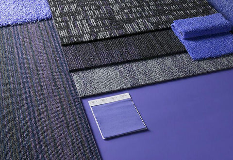
On the surface, it's tough to picture such a brilliant color being gracefully blended into an office atmosphere, but mixing it with other colors to balance out the colorful tones might help give it a commercial edge. The Star of the Show was one of Pantone's palettes; here, the warm neutral tones offer a feeling of grounding, which helps to keep Very Peri from being too overwhelming. Instead, it adds a splash of color that sparks curiosity and engagement, and it has the potential to give commercial environments a much-needed whimsical twist.
Olive Sprig is PPG's color of the year, which comes after a period of uncertainty. 'Elegant, grounded, flexible, and extremely adaptable, signifying renewal and emulating nature's resiliency,' says the designer of the delicate grey-green tint.
The color is inspired by the idea of a horizon, which represents both contemplation and anticipation of what can happen in the next year.
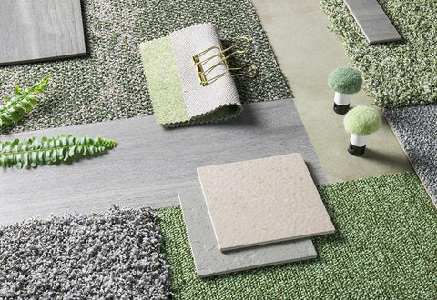
Green may be one of the less unexpected options on the list. Still, it's a powerful one with much adaptability, as it continues to gain appeal in interior design in both commercial and residential environments. Olive Sprig is a versatile color suited to most situations, styles, and applications, illuminating an area with an organic vitality. Of course, as organizations focus on raising employee wellbeing, biophilic design plays a significant role in commercial settings, and Olive Sprig brilliantly exemplifies these ideas.
In this case, we can see how green may help to balance out the warm neutrals in our product selections. The product combinations here are soft and pattern; the goal is to be understated and convey a sense of refinement.
Sherwin Williams has picked 'Evergreen Fog,' a relaxing, adaptable green color with grey and blue overtones, to symbolize fresh beginnings, with significant parallels to PPG's Olive Sprig. The color was chosen to assist designers in achieving a modern, organic' sense in the environments they design by complementing neutrals nicely.
Evergreen Fog is incredibly customizable, encapsulating the ongoing residential trend of bringing home decor components into the workplace to maximize comfort. You may use it as an overall tone in a room or match it with a palette of equally warm and inviting colors.
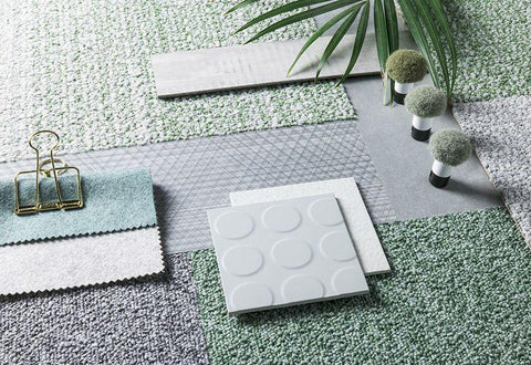
For years, we've been embracing this trend for earthy, nature-inspired greens in our product palettes. PPG and Sherwin Williams' colors are similarly similar to Dulux's 2020 Color of the Year, Tranquil Dawn, which highlighted a common desire to embrace nature – something that has given an escape for many of us during the previous two years. As we move away from vivid limes and towards more subtle hues of green, these colors signify an increase in the use of sage and olive tones.
Finally, Matace has selected kiwi, a yellowish-green color, as its Color of the Year in 2022 removable carpet. The color is light and airy, making it ideal for businesses looking to add subtle pops of color to their commercial spaces.
Kiwi is an uplifting hue that encourages biophilic design and can be readily weaved into a room to produce a sense of happiness, similar to PPG and Sherwin Williams' options.
Another fan favorite is slate grey to give the product mixtures a soothing effect.
These extra tabletops pick up on the blue tone as a highlight tone. It's obvious to notice how well the Blue Skies tone blends in with other colors! We've been creative with the coordinating goods here, which will provide interest and a distinctive twist to your interior design in an indoor environment.
When looking at the color palettes for the 2022 removable carpet, it's evident that the trend toward soft, adaptable, earthy tones that encourage our connection to nature will continue. However, we can't ignore the rising appeal of more forceful tones that reflect our changed way of life and work. These more vivid tones should not be avoided; instead, they should be embraced as a chance to provide pops of color and inject a feeling of vitality and energy into commercial spaces.
We're excited to watch how these colors evolve throughout the year and into the future and how we can continue to incorporate the current trends into our goods.
Leave a comment